Base cards:
1 Mike Trout
212 Jason Heyward
24 Manny Machado Future Stars
240 Ernesto Frieri
178 Erik Johnson RC
235 Jason Kipnis
25 Troy Tulowitzki
157 Matt Adams Rcup
51 Kyle Lohse
181 Jim Henderson Rcup
30 Mark Buehrle
176 Alex Cobb
275 Nolan Arenado
303 Andres Torres
169 Nick Franklin Future Stars
87 Tyson Ross
300 Yu Darvish
238 Alberto Callaspo
151 Bruce Chen
302 Carlos Gomez
131 Junichi Tazawa
165 Rajai Davis
78 Bronson Arroyo
54 Andrew Lambo RC
100 Bryce Harper
248 Travis D'Arnaud RC
128 Erasmo Ramirez
114 Francisco Liriano
96 Wily Peralta
57 Yadier Molina
123 James Paxton RC
301 Shane Victorino
183 Darwin Barney
173 Brandon League
134 Josh Donaldson
211 Dioner Navarro
268 Don Kelly
152 Jonathan Herrera
42 Mariano Rivera
39 David Murphy
294 NL Wins Leaders Wainwright, Zimmerman, Kershaw
153 AL RBI Leaders Davis, Cabrera, Jones
321 Mariano Rivera Checklist
112 Torii Hunter
86 Wilmer Flores RC
180 Ben Revere
16 Johnny Cueto
230 Andre Rienzo RC
69 Jhoulys Chacin
167 Jeremy Guthrie
11 Mike Carp
137 Boone Logan
97 Alex Gordon
246 Eduardo Nunez
73 Kyle Seager
31 Victor Martinez
185 Howie Kendrick
304 Juan Lagares
113 NL ERA Leaders Kershaw, Fernandez, Harvey
105 Ryan Howard
320 Hector Santiago
98 Edwin Encarnacion
99 Melky Cabrera
124 Jay Bruce
101 Chris Nelson
53 Clay Buchholz
307 Jake Peavy
290 Chad Bettis RC
206 Jon Lester World Series
213 Justin Smoak
286 Josh Fields
70 Marcell Ozuna
239 Jeff Samardzija
200 Derek Jeter
273 Mark Derosa
After years of having short printed variation cards, now Topps is using photos that seem like they would be a variation but they aren't. Silly Topps messing with your customers.
I pulled duplicates of the following cards that I would be happy to unload: 1, 11, 31, 69, 97, 113, 114, 128, 137, 152, 167, 185, 230, 248, 268, 304
Some thoughts. The base set design seems to be getting mixed reviews from the community. I don't particularly love it but I also don't hate it. It is a nice enough change from last year to be a little bit fresh. But overall Topps is boring us to death with the same bland white borders and a little bit of foil year after year after year. I know a lot of people have bashed the team name tab on the right hand side of the card. And I somewhat agree. It reminds me of mid-2000's Upper Deck cards that had a similar look.
As far as the inserts go I have some likes and dislikes.
0449/2014
There are way too many parallels. We already had the retail exclusives with Walmart blue, Target red and Toys r Us purple. But now adding green and yellow parallels as well? It's just too much. Enough already. The red foil parallels I like though. They look pretty good in person and I like them better than the emerald green from last year but not as much as the cognac and silver of 2012 and 2011. An improvement nonetheless.
My scanner doesn't like diecuts for some reason and likes to cut the protruding edges off.
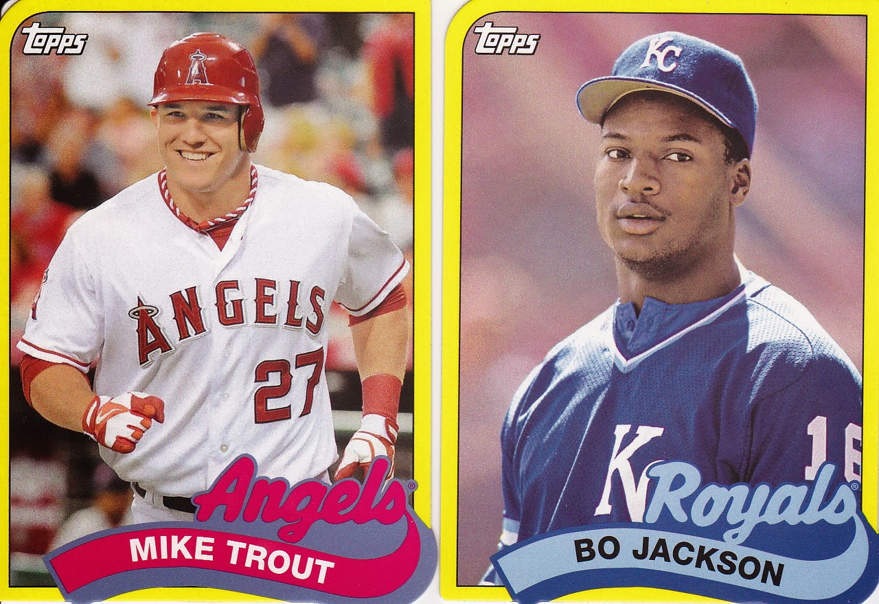
As far as the minis go, I normally hate them. Really, I can't stand them. I got so tired of them last year being in most of the products I opened. I just don't like them. They're more difficult to store and in the case of sets like Gypsy Queen and A&G most of them are nothing more than the regular card in miniature form. I'd rather just receive an extra base card in a pack than a mini. I may actually be trying to unload most of my minis pretty soon since some collectors do like them. This year's edition of minis though are not that bad. I like that these are diecut. If not for design then at least to know that Topps had to spend a little bit more money to produce them. Take that you corporate jerks!
I do not like these inserts. They just look cheap. They look more like something that would be an insert set in Opening Day. Topps fail.
These ones on the other hand I think I may like. They strike me as being like a base card in a high end set, except on thin cardstock of course. I do think I like them.
I am not planning on trying to put together the whole set so most of these cards are available for trade if you're interested. Particularly the base set duplicates. Just shoot me an email!
Thanks for reading!


I could use that red Michael Young and I love minis.
ReplyDelete